


A World of Possibilities | become manifesto
2:15
.png)
India’s Best Graphic Design Studio 2024
India’s Best Graphic Design Studio 2022
India’s Best Design Project Studio 2022
India’s Best Design Studio 2021
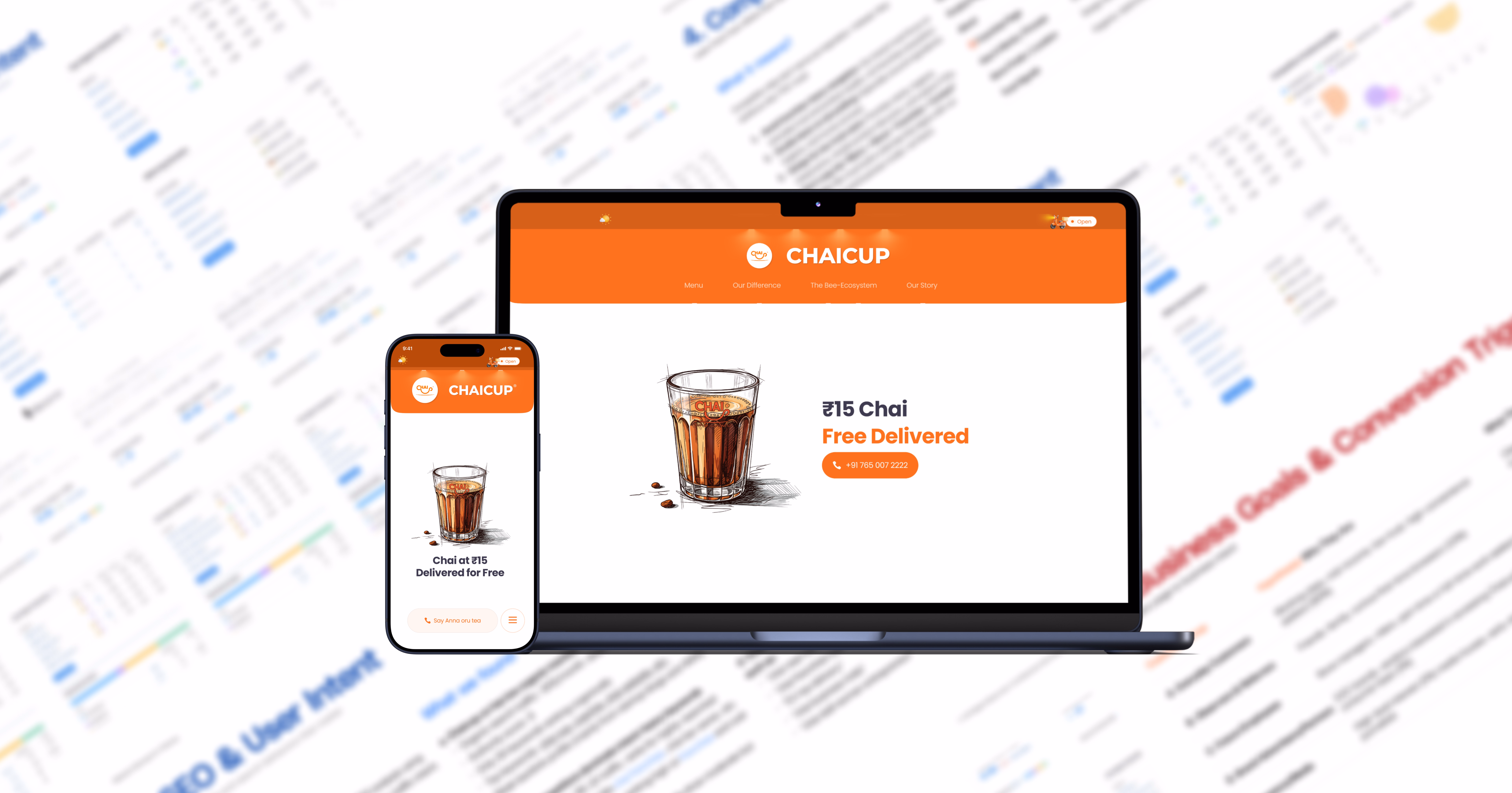
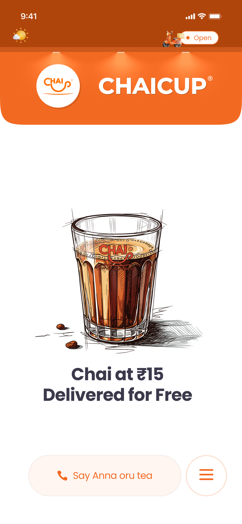
Instead of leading with promotions, the website was designed to feel like a place users can explore, understand, and trust. Every interaction supports clarity, consistency, and a sense of everyday presence.
Users interact with digital products at different levels of comfort and confidence. Clear hierarchy, predictable flows, and simple language were essential to avoid confusion and drop-offs.
Global design references emphasise simplicity and precision.The challenge was ensuring these standards translated into an experience that still felt intuitive and familiar.
A digital experience often lacks the reassurance that comes naturally in human interactions. Without careful design, interfaces can feel cold, transactional, and difficult to trust—especially for first-time users.
Delight alone does not guarantee trust.
The challenge was making delight meaningful and lasting.
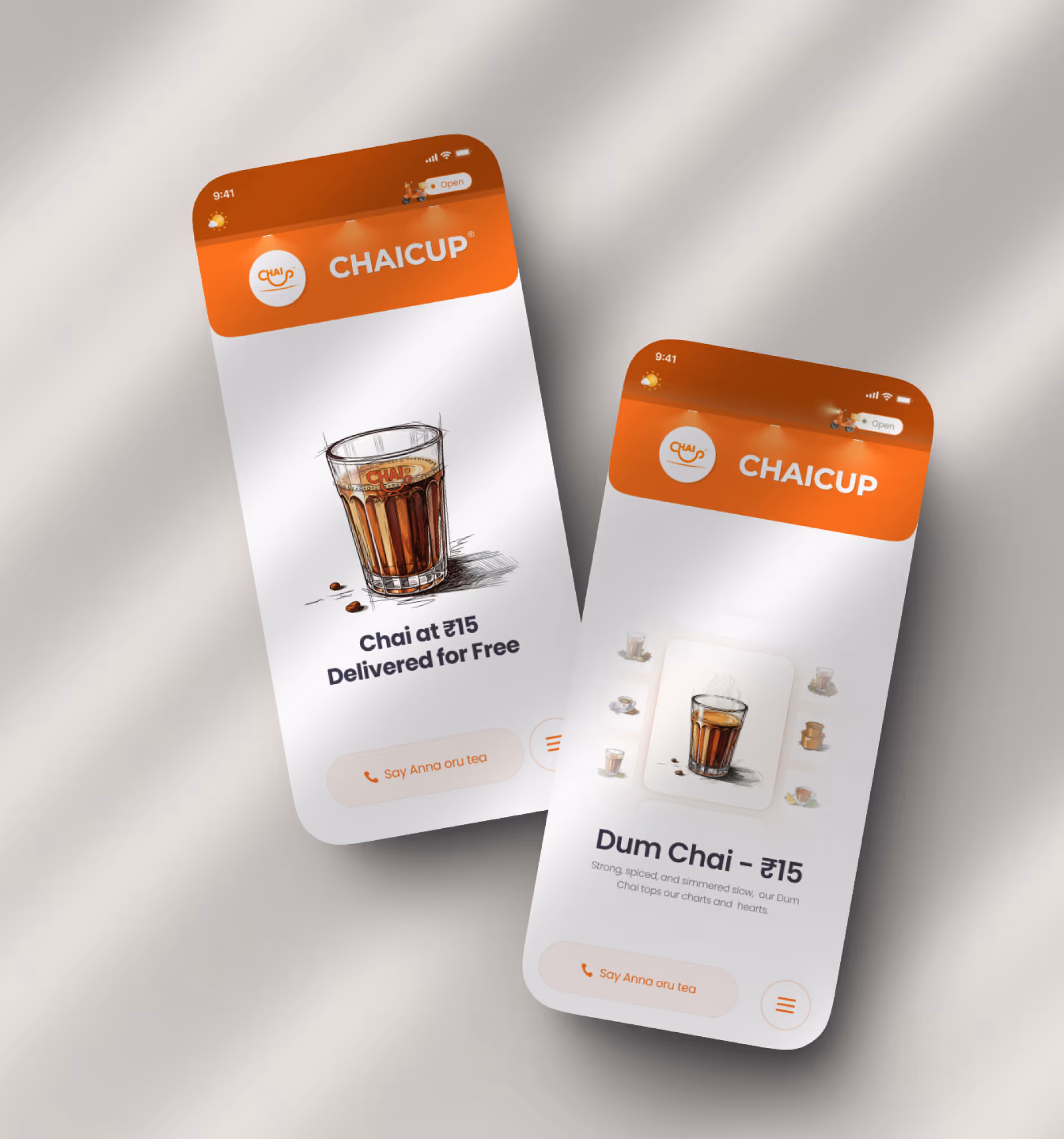
A calm, confidence-building flow that replaces campaign-style persuasion with familiarity and trust.
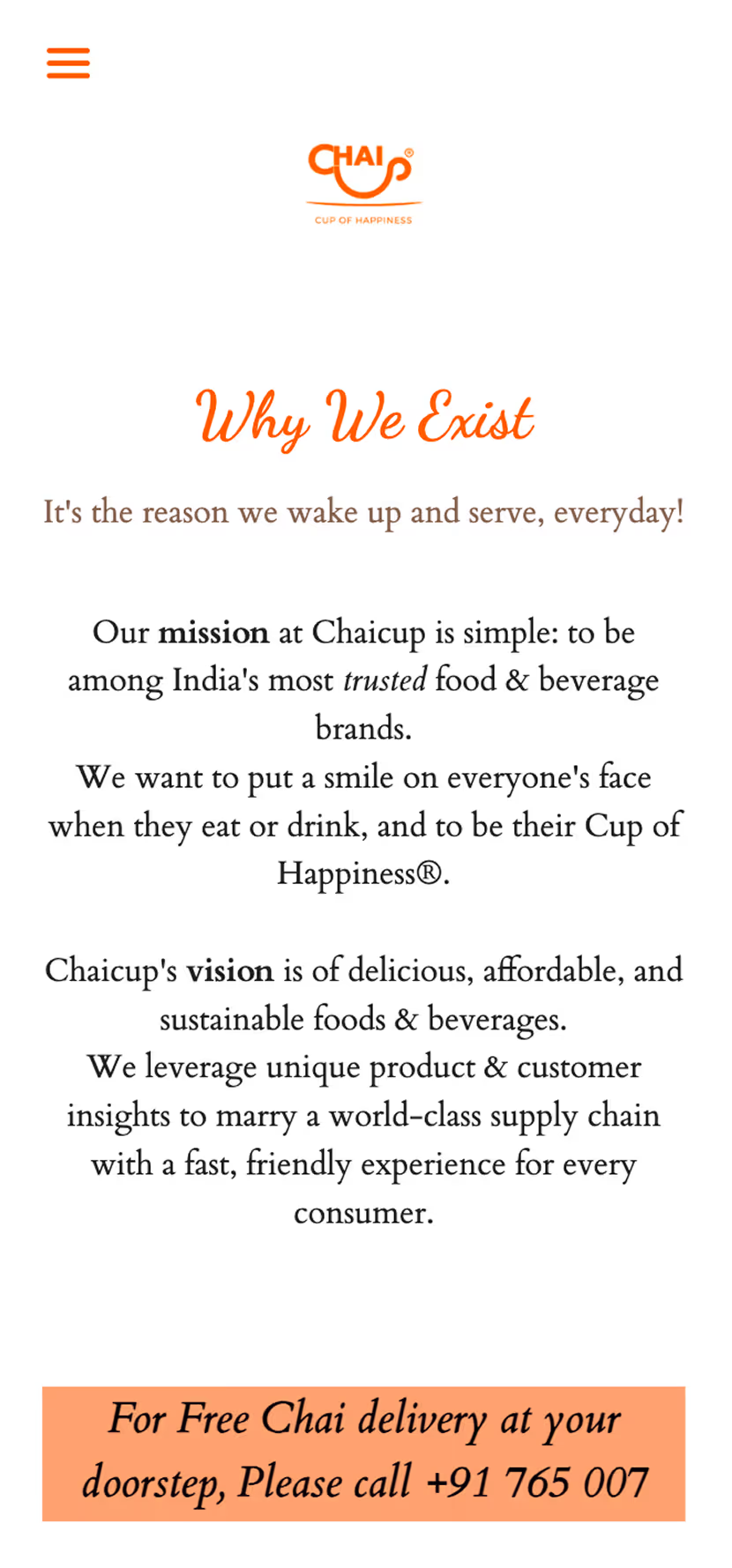
Clear, progressive information designed for quick understanding without overload.
Optional moments of play and interaction that enhance recall without interrupting the journey.
Users interact with digital products at different levels of comfort and confidence. Clear hierarchy, predictable flows, and simple language were essential to avoid confusion and drop-offs.
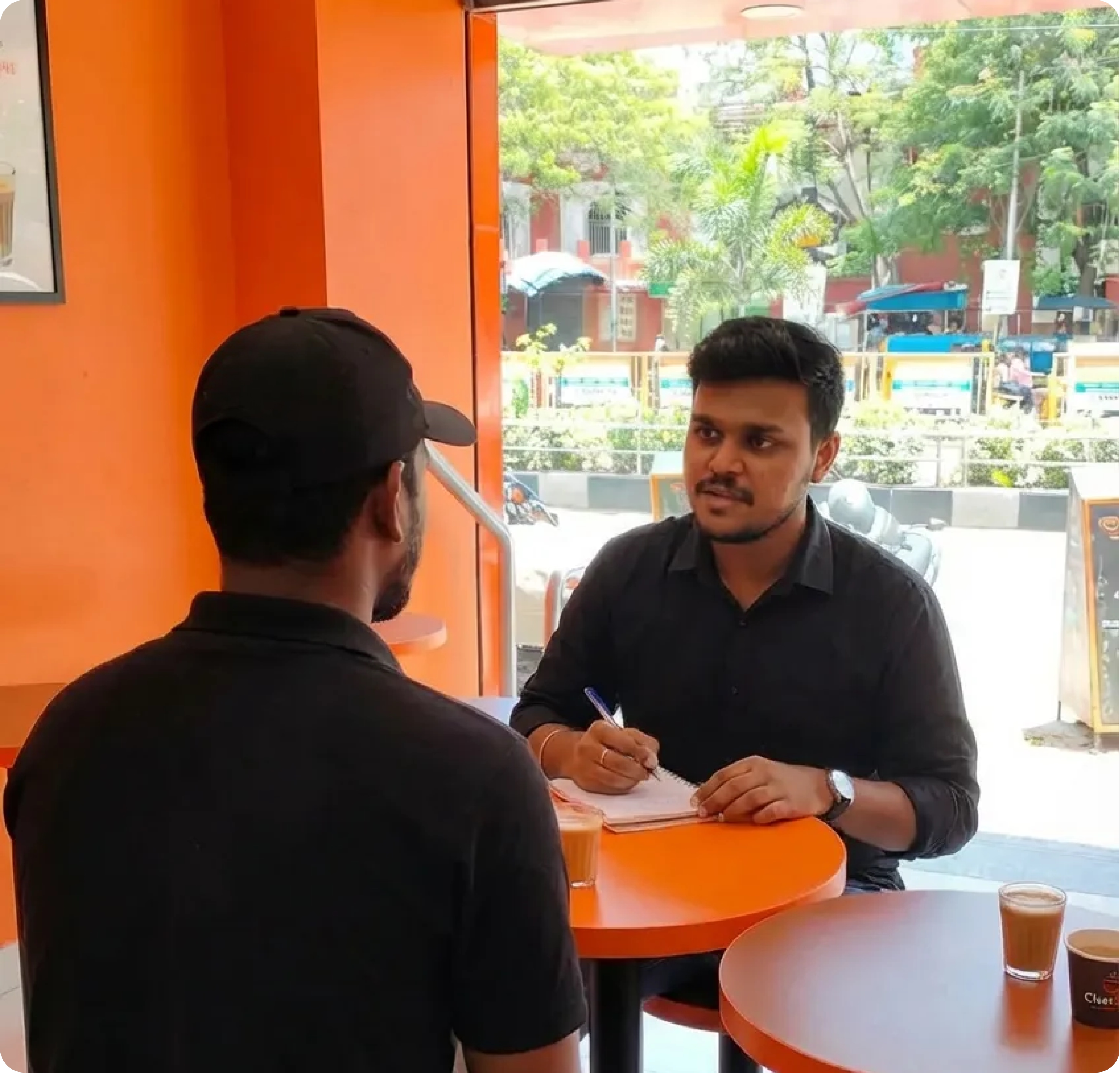
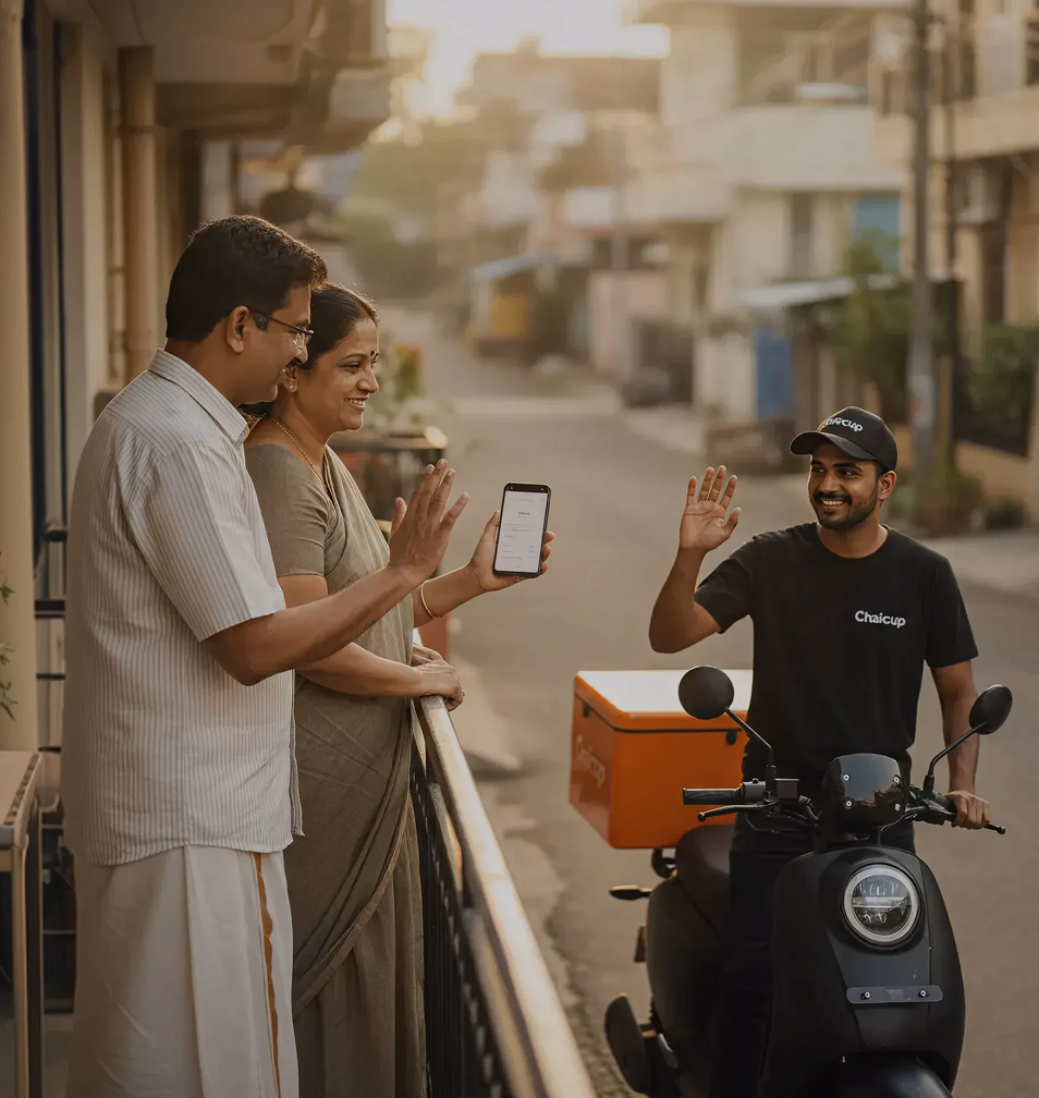
We conducted on-ground conversations to understand everyday buying behaviour and expectations. These discussions helped surface what builds trust, comfort, and repeat habits.
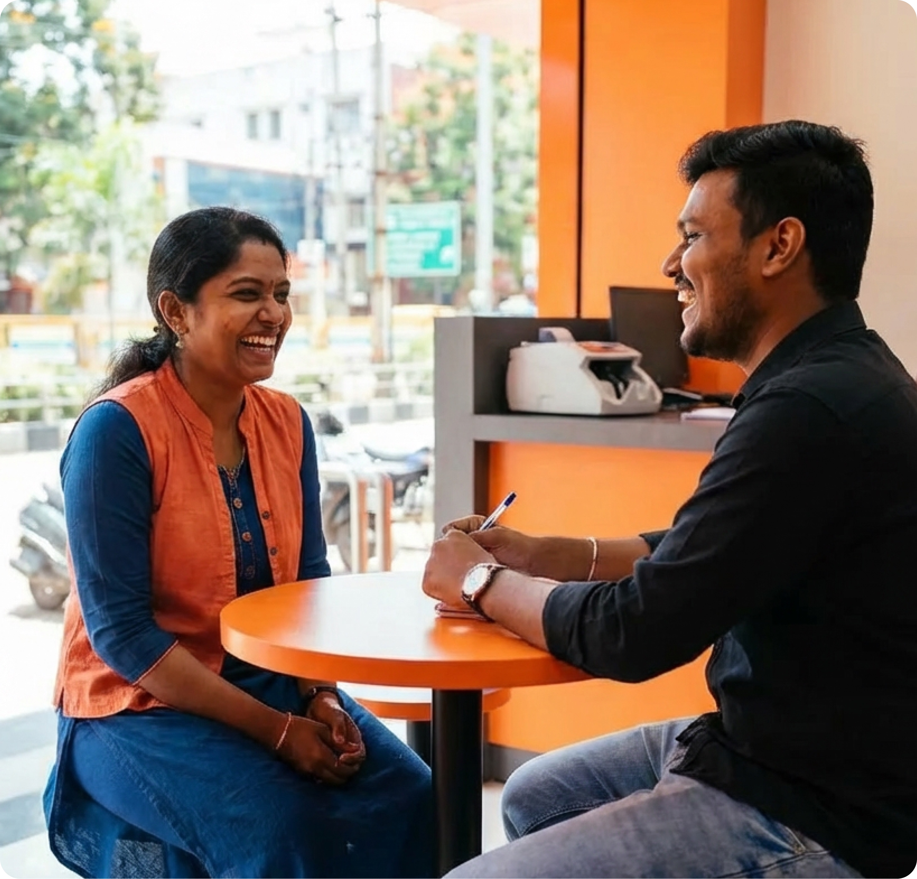
Casual conversations helped reveal how comfort and familiarity shape trust. These moments highlighted the importance of warmth, tone, and approachability in everyday interactions.
Conversations with on-ground teams highlighted how trust is built through consistency and human presence.
Global design references emphasise simplicity and precision.
The challenge was ensuring these standards translated into an experience that still felt intuitive and familiar.


.webp)

.avif)
A digital experience often lacks the reassurance that comes naturally in human interactions. Without careful design, interfaces can feel cold, transactional, and difficult to trust—especially for first-time users.
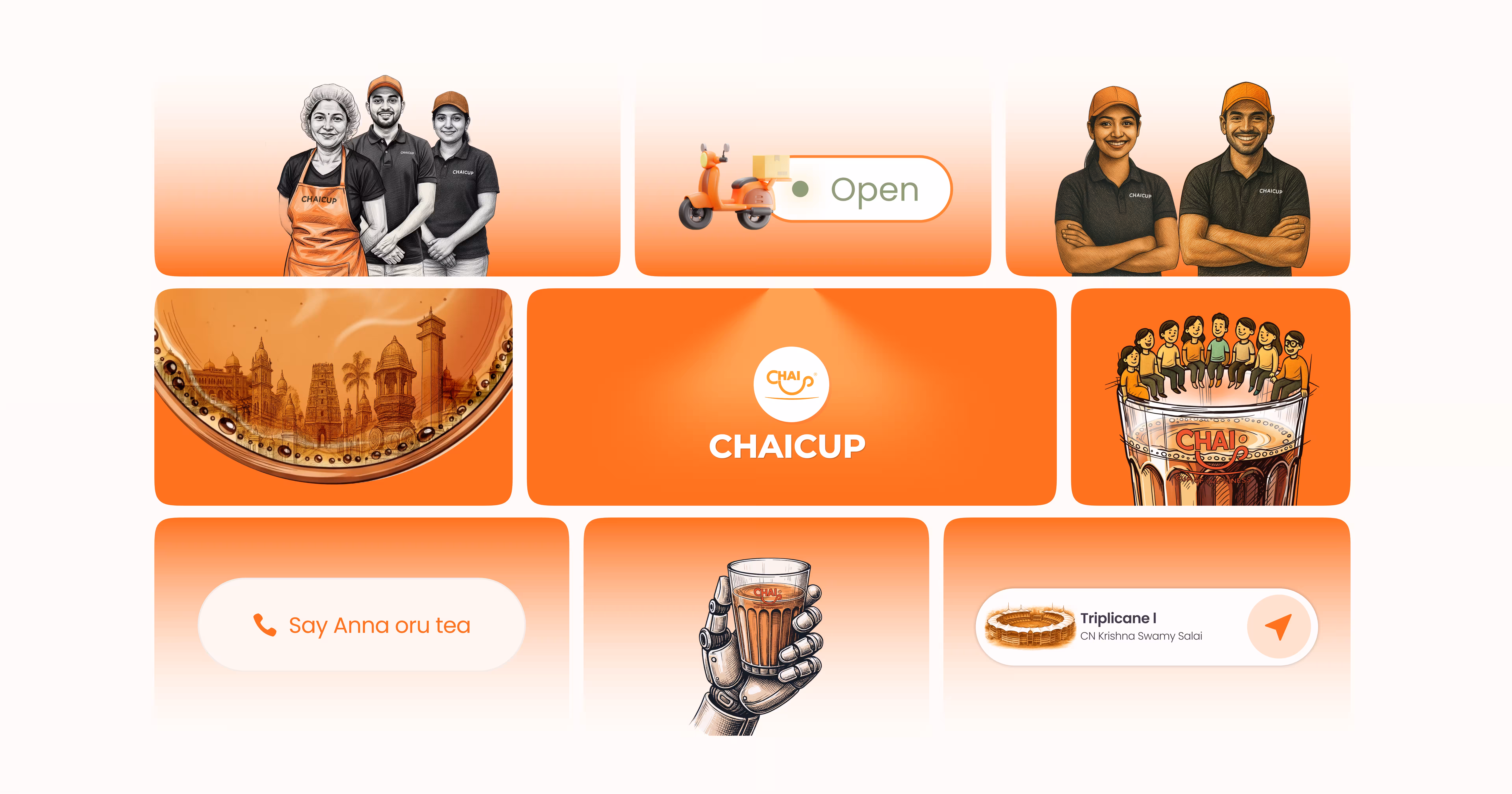
Bold, vibrant illustrations were explored to reflect local culture and energy.

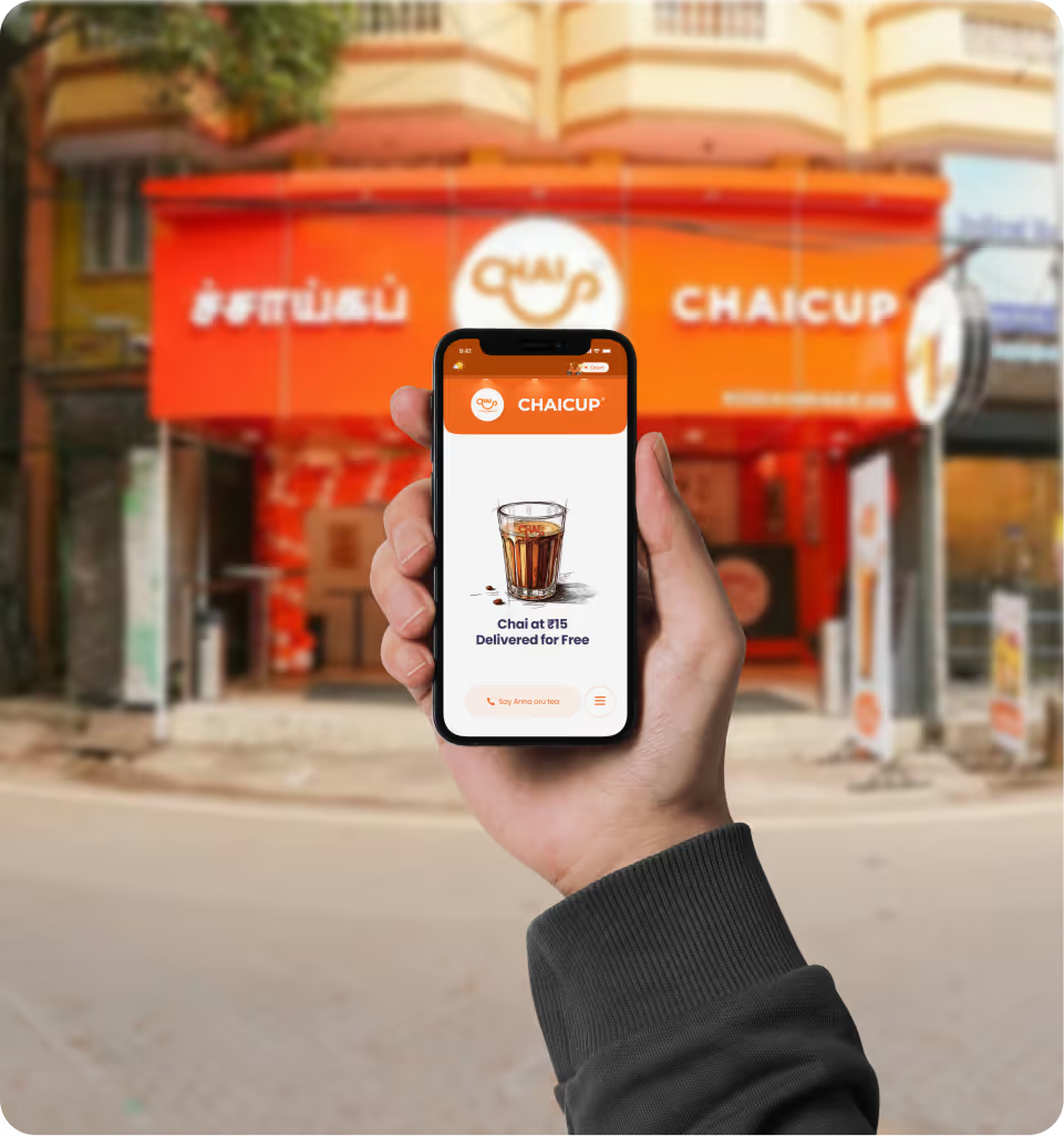
Photography paired with strong brand colours grounded the experience in reality.
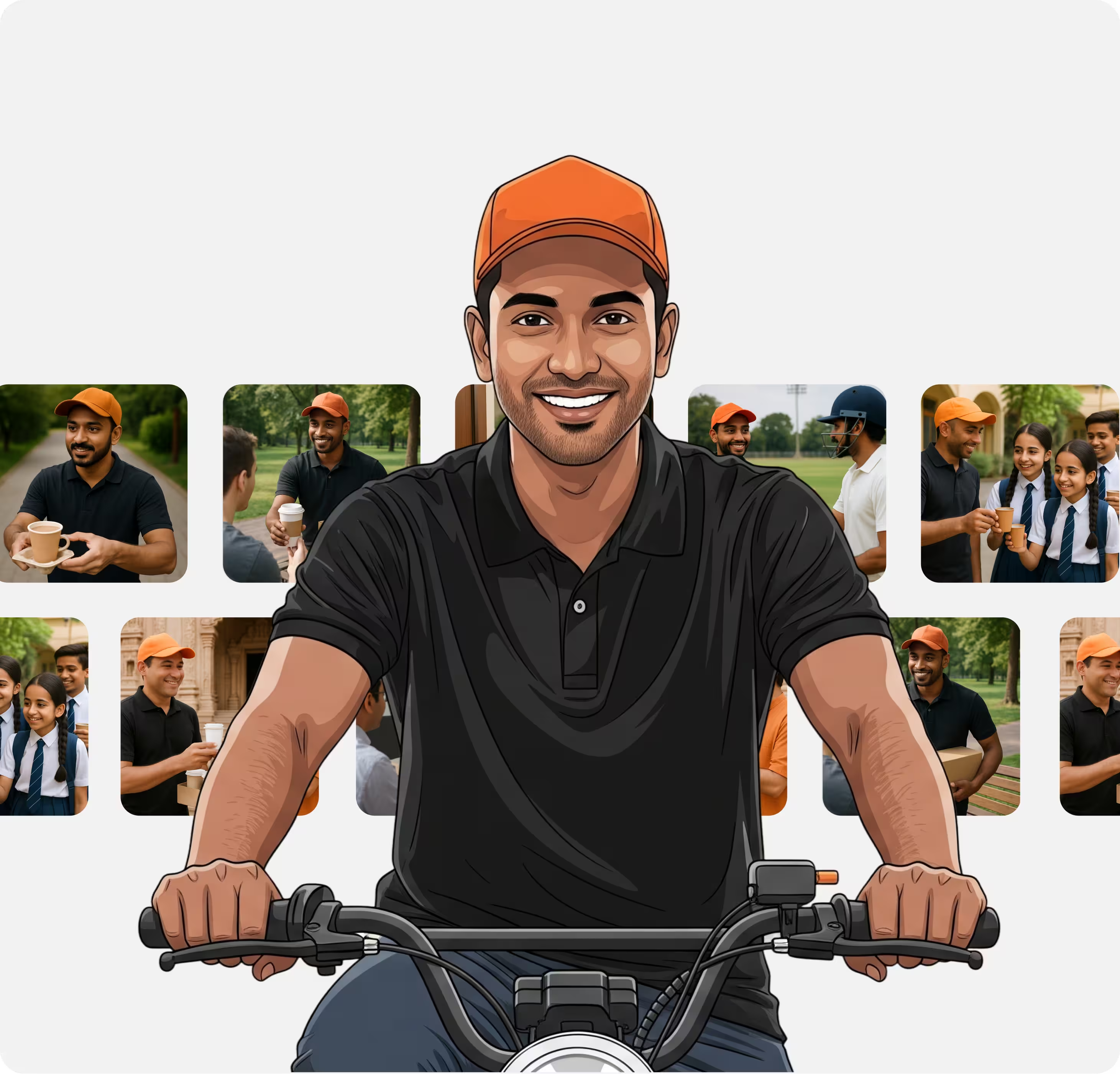
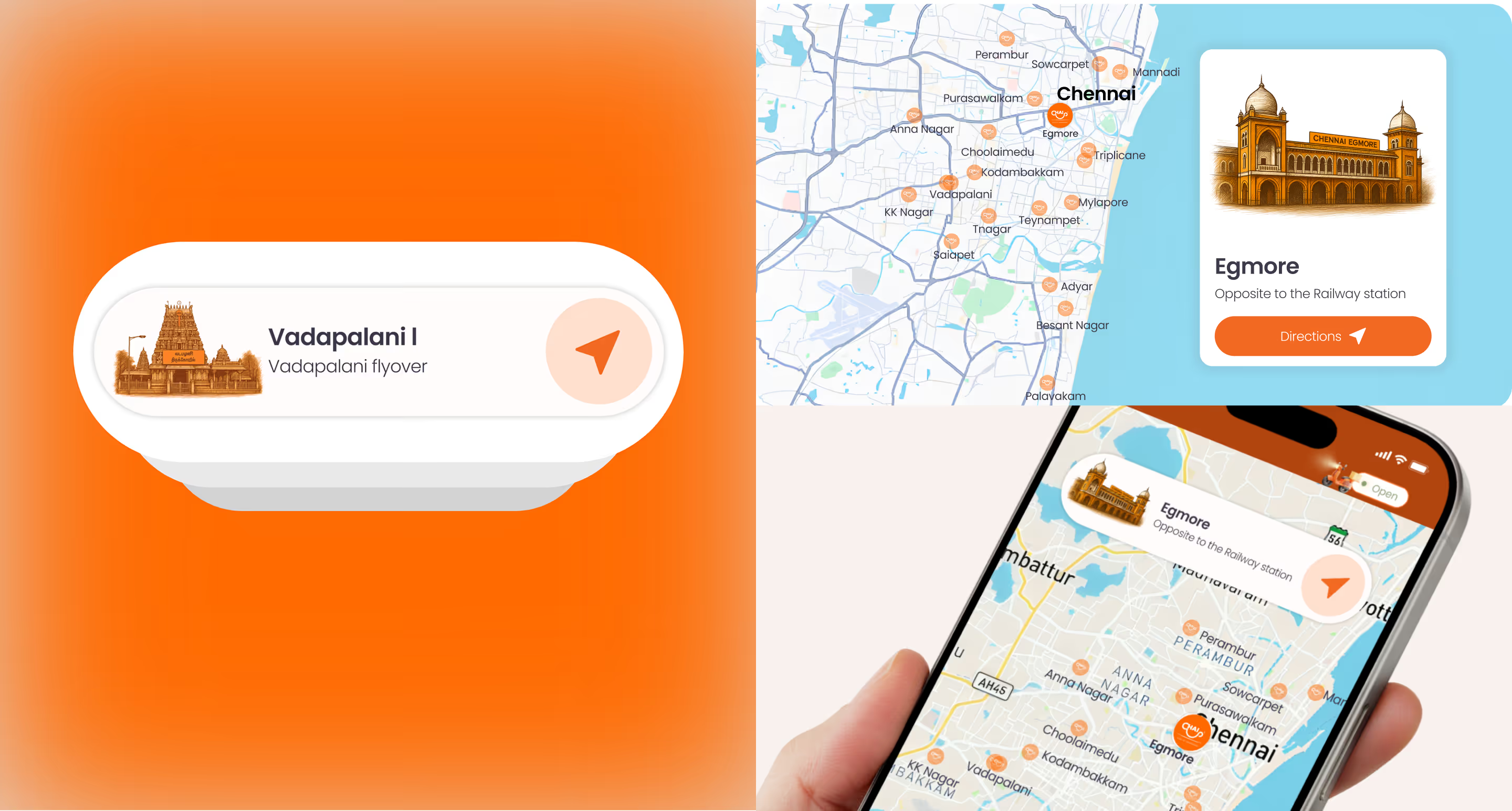
A delivery-focused narrative emphasised reach and availability across locations.
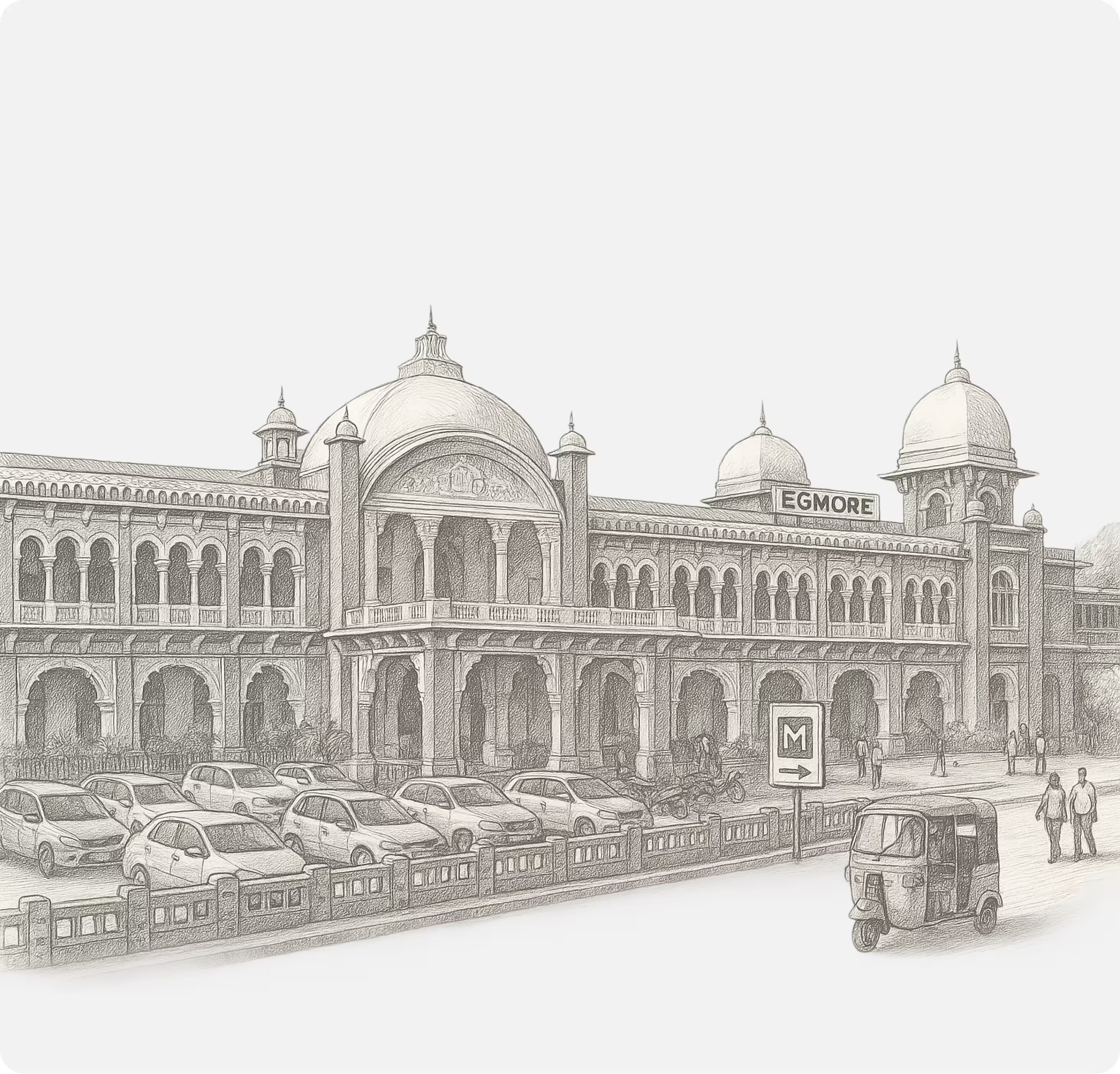
Hand-drawn, monochrome illustrations were explored to evoke calm and simplicity.

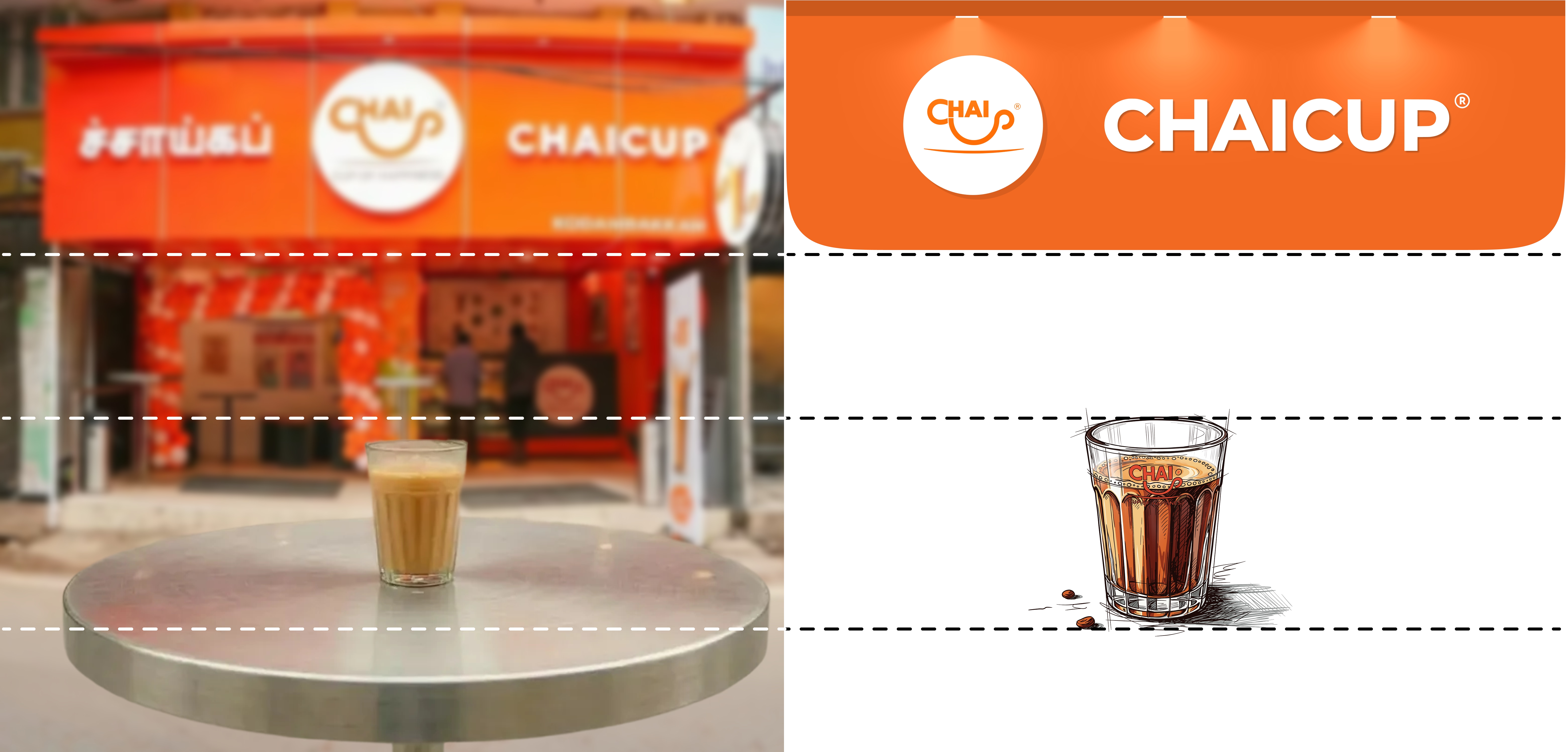
Inspiration was drawn from premium digital products that practice restraint, along with
everyday physical tea stores where trust is built before purchase.
Delight alone does not guarantee trust.
The challenge was making delight meaningful and lasting.
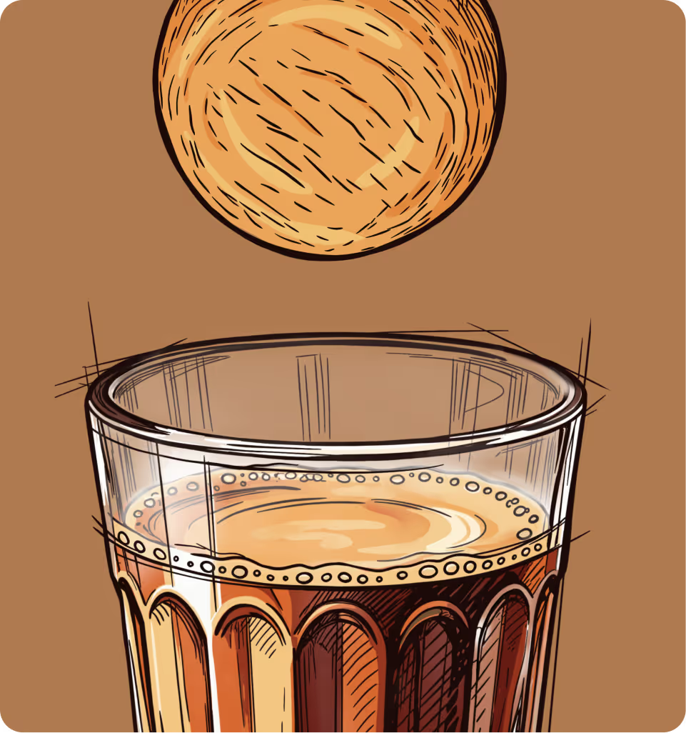
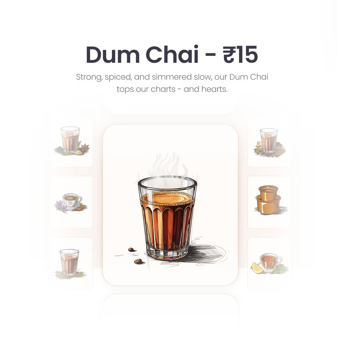
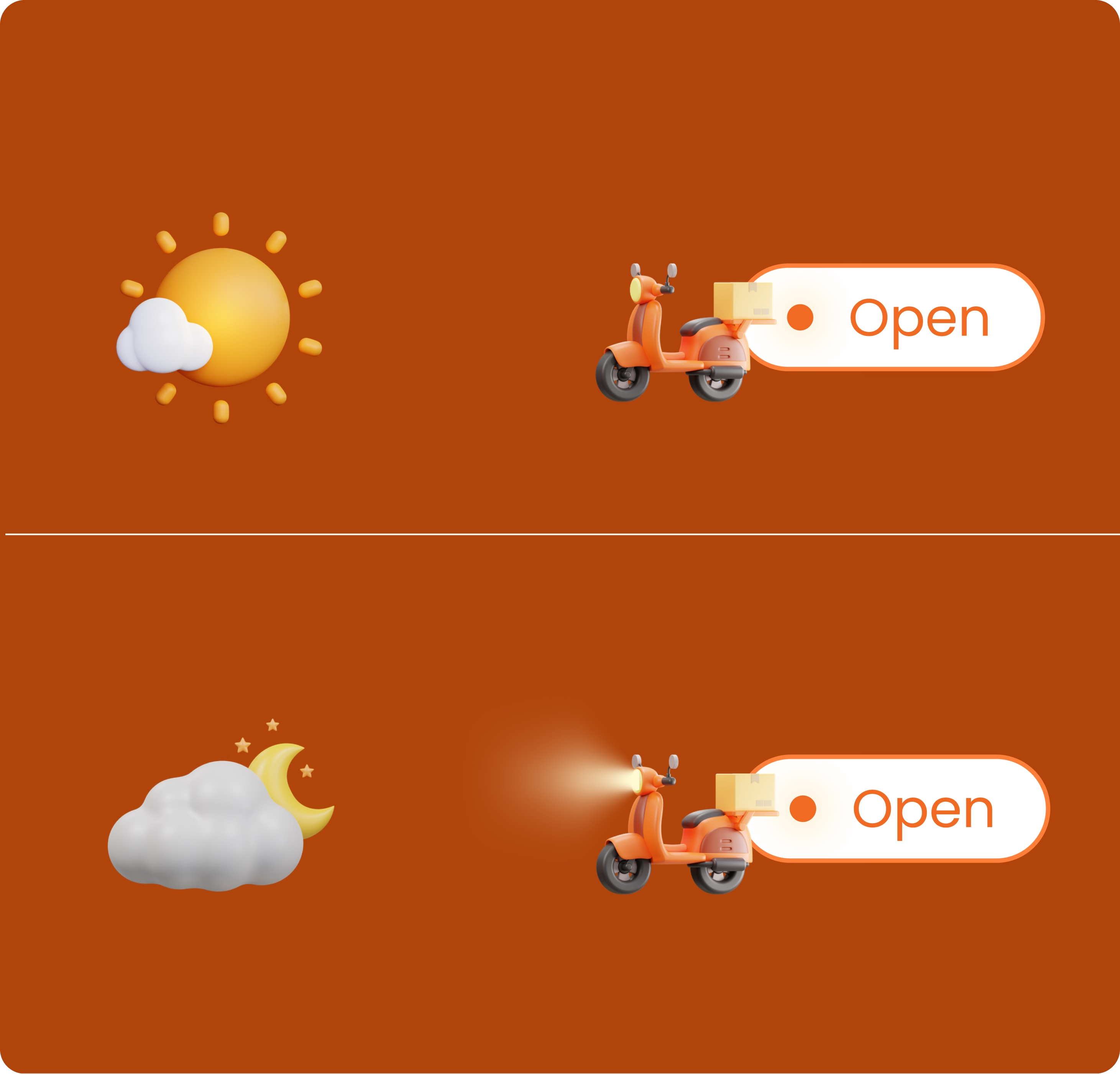
Waiting is treated as a moment, not a delay.
The pouring animation adds warmth and familiarity to the experience.
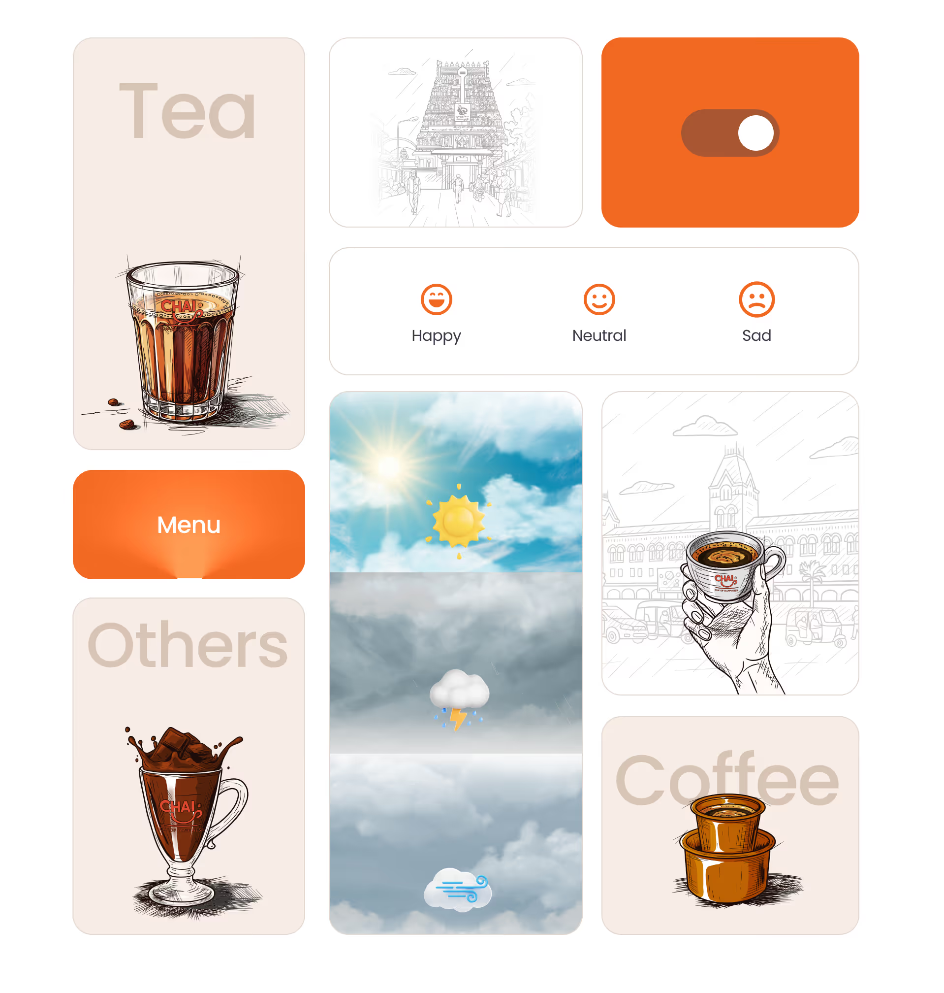
Cards
People sounds

Game
Crow

Store light
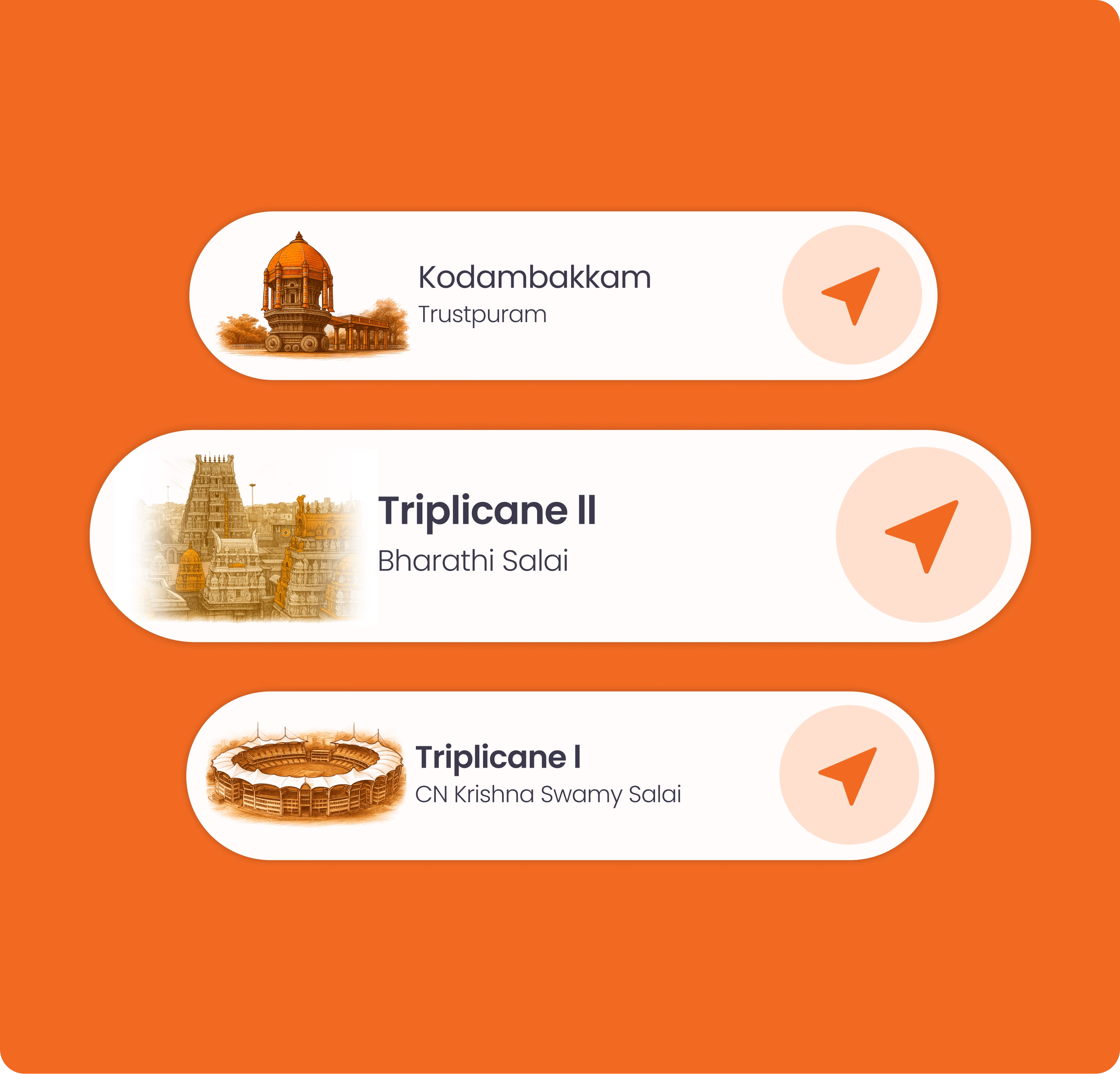
Map

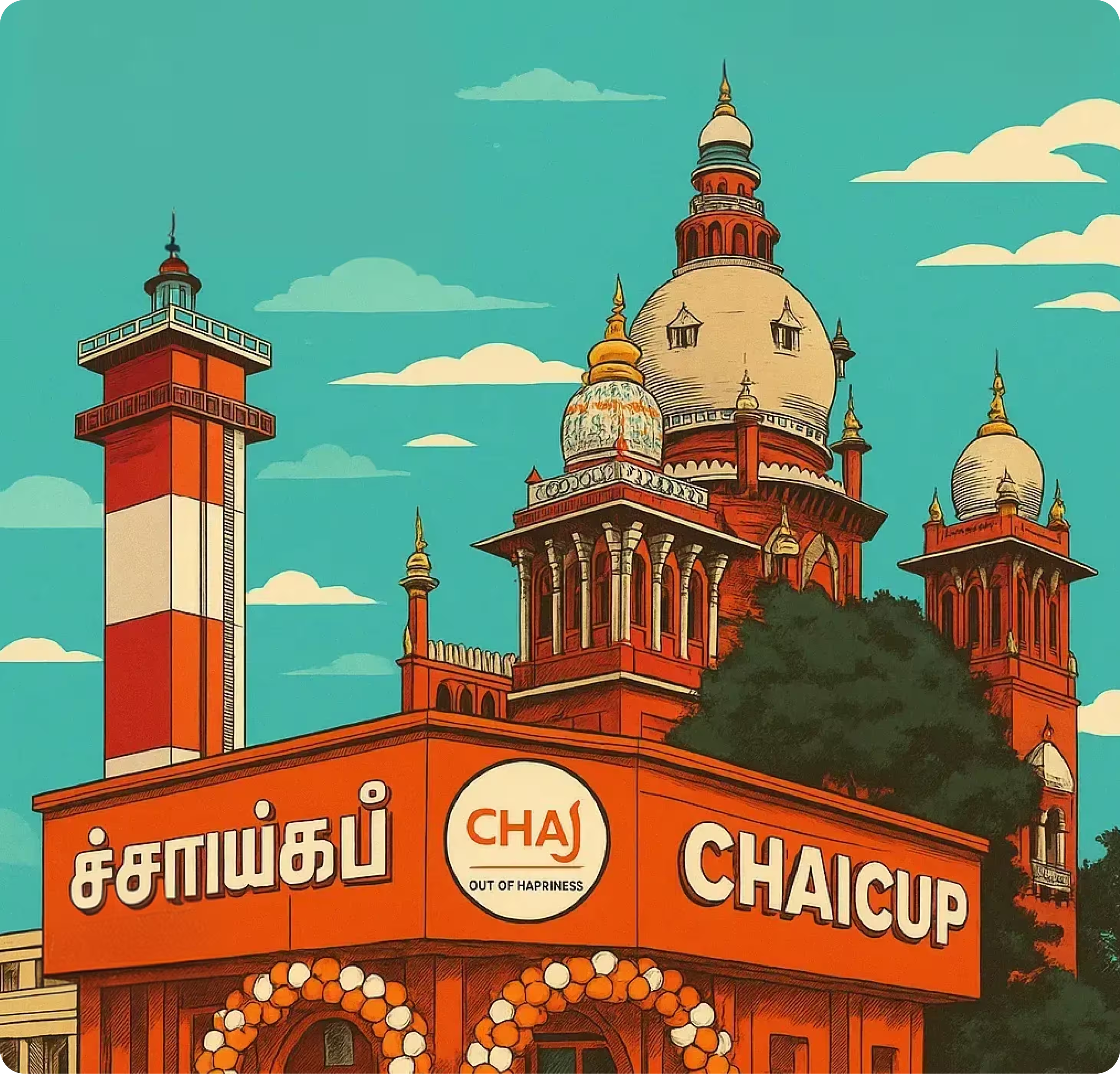
AI generated Illustration

AI generated Image
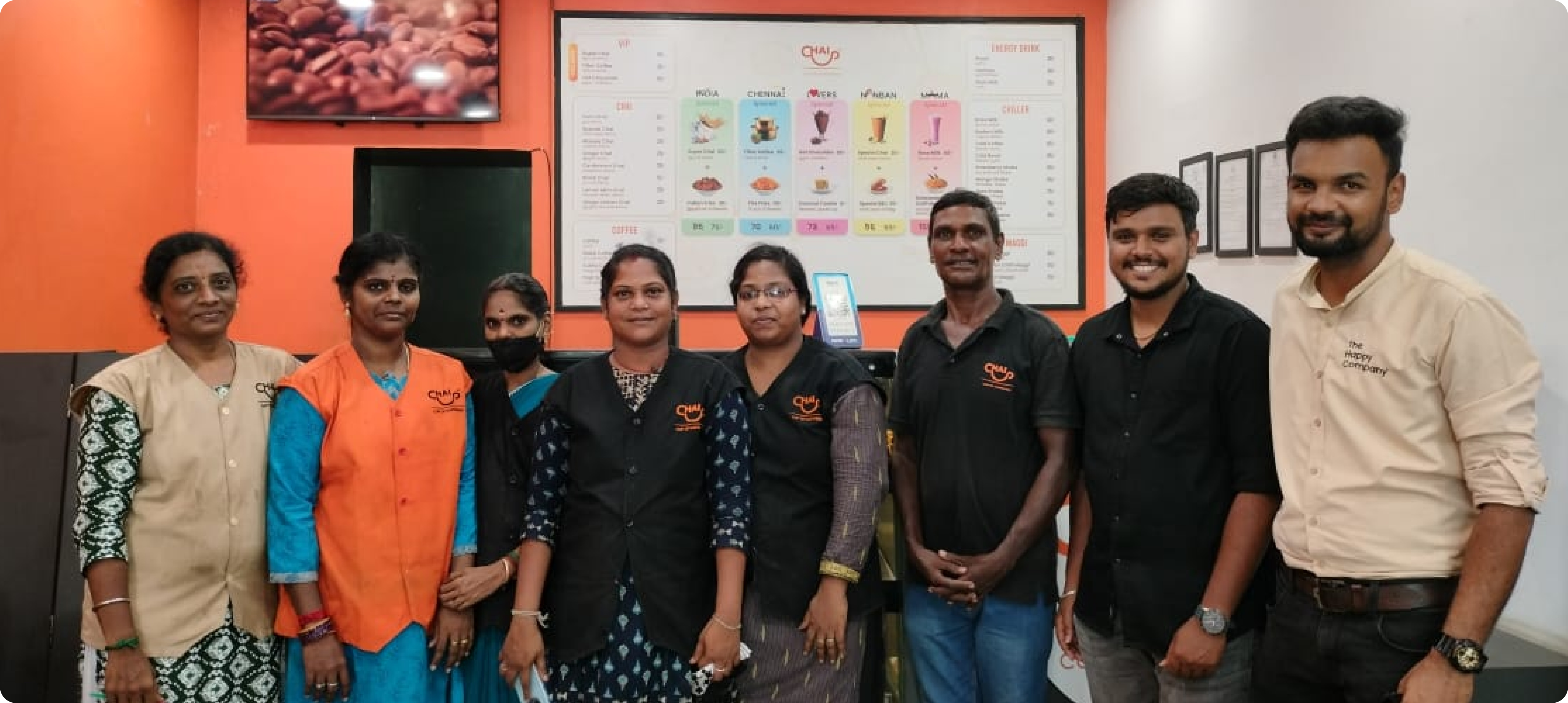
We pride ourself on this in-depth exploration of various elements for this project. Our projects are created with precision and subtlety, and every design decision is made with an intent that generates value in its usage.
.svg)


.png)